 ScoreMySite
Teardowns
Landing page reviews of the web's best sites
Jev AI scores each page, then we write an in-depth review: what's costing conversions, a rewritten hero, and exact copy fixes.
Capturing screenshot…
beehiiv.com
SaaS
“NEWSLETTERS.PODCASTS.COMMUNITY.ONE PLATFORM.” sells your product categories rather than the customer’s outcome. In the most valuable space on the page, a creator or small publisher should immediately see how beehiiv helps them build an audience and earn—not just consolidate tools.
Capturing screenshot…
stripe.com
SaaS
Your opening leads with “Financial infrastructure” rather than what a business can do with Stripe. That makes a visitor translate the category into their own needs before the generic “Get started” button asks them to act.
Capturing screenshot…
ahrefs.com
SaaS
“Make your business discoverable—in search, AI, and beyond” describes an ambition, not a clear buying reason. “And beyond” makes an already broad platform sound even broader, leaving visitors to work out what Ahrefs will actually help them do.
Capturing screenshot…
monday.com
SaaS
“People and agents working as one team” describes a concept, not a compelling business outcome. Visitors have to read further to discover what agents actually do and why that matters to their team.
Capturing screenshot…
intercom.com
SaaS
“A complete system” describes the product but doesn’t sell the advantage. Your strongest reason to choose Intercom—one connected helpdesk where human conversations help improve Fin—is explained farther down instead of being made obvious in the hero.
Capturing screenshot…
cal.com
SaaS
“The better way to schedule your meetings” names the category but gives visitors no concrete reason to choose you. The subheadline then spreads attention across individuals, businesses, and developers instead of making the everyday scheduling benefit obvious.
Capturing screenshot…
hubspot.com
SaaS
Your hero sells broad outcomes before clearly naming what visitors are buying. “Build demand, win deals, and delight customers” could describe an agency or consultancy; pairing it with “Agentic Customer Platform” adds terminology when you need immediate product clarity.
Capturing screenshot…
posthog.com
SaaS
“Your product's context layer” asks visitors to understand your positioning before they understand what PostHog will do for them. The supporting copy explains ingestion and querying, but the compelling payoff—finding problems and helping developers ship fixes—appears later.
Capturing screenshot…
resend.com
SaaS
“Get started” gives developers no clear expectation of what happens next or how much work is involved. You already promise that they can send emails in minutes, but you don't connect that promise directly to the primary action.
Capturing screenshot…
loom.com
SaaS
“One video is worth a thousand words” is memorable, but it could describe almost any video product. You make first-time visitors read further to discover that Loom records their screen and camera, then lets them share the recording—a clarity gap in the most heavily weighted conversion area.
Capturing screenshot…
calendly.com
SaaS
“All the work around meetings, handled.” sells a broad promise before explaining what Calendly actually does. You’re asking visitors to understand the expanded product before giving them the simple reason to start: book meetings without the back-and-forth.
Capturing screenshot…
notion.so
SaaS
“Where teams and agents Think together.” asks visitors to interpret your positioning before they understand your product. It does not immediately explain that Notion brings team knowledge, answers, and automated work into one workspace—the reason a new team would consider adopting it.
Capturing screenshot…
clickup.com
SaaS
“Software to replace all software” sells an enormous promise before explaining what ClickUp actually does. Visitors need to understand the workspace first; otherwise, “perfect context” and “infinite productivity” give them more claims to decode rather than a clear reason to start.
Capturing screenshot…
gumroad.com
SaaS
“Go from 0 to $1” gives visitors a goal without clearly identifying the offer. Make it immediately obvious that Gumroad helps people sell their knowledge, creative work, and subscriptions—not just earn money somehow.
Capturing screenshot…
typeform.com
SaaS
“Your favorite forms.Now with AI automation.” assumes visitors already know and love Typeform. It announces a product update instead of explaining why a business should choose your forms, leaving your strongest benefits buried further down.
Capturing screenshot…
mailchimp.com
SaaS
“Email & SMS marketing minus the learning curve” sells ease before it sells the business outcome. For a small-business buyer, the headline should connect email and SMS to sales immediately, with ease as the supporting reason to choose Mailchimp.
Capturing screenshot…
zapier.com
SaaS
“Welcome to automation in the agentic era” announces a technology shift instead of explaining what your customer gets. Headline clarity carries 35% of the conversion assessment—the largest weight—and this is your weakest major conversion area.
Capturing screenshot…
supabase.com
SaaS
“Build in a weekendScale to millions” promises speed and scale without identifying the product. Headline clarity is only 6.9/10, and because the headline carries the most conversion weight, making “Postgres backend” immediately explicit should be your first fix.
Capturing screenshot…
wix.com
SaaS
Your hero sells an aspiration instead of the product’s practical value. “Create your future” and “Wix Harmony” make visitors interpret your positioning when you could immediately tell them they can build an AI-powered website and run their business from it.
Capturing screenshot…
raycast.com
SaaS
Your hero sells a feeling before explaining the product. “Your shortcut to everything” could describe almost any productivity app; visitors need to understand that Raycast is a keyboard-first launcher before the broader promise becomes persuasive.
Capturing screenshot…
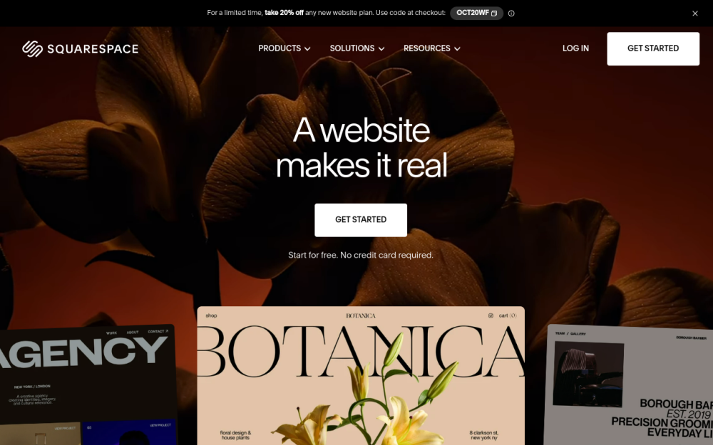
squarespace.com
SaaS
“A website makes it real” is a brand line, not a clear offer. It leaves a new visitor to infer that Squarespace helps them build a professional website and sell products, offer services, or showcase their work—the weakest point in the most heavily weighted conversion area.
Capturing screenshot…
webflow.com
SaaS
“Build for what’s next” could describe almost any technology company. It spends your most valuable space on a brand sentiment instead of telling marketing and web teams that Webflow helps them build, publish, and grow websites without operational bottlenecks.
Capturing screenshot…
asana.com
SaaS
“The OS for human-agent teams” introduces a category rather than explaining what customers can accomplish. Enterprise buyers should immediately recognize project and workflow management—not have to infer it from your AI positioning.
Capturing screenshot…
grammarly.com
SaaS
“Think big. We’ll take care of the details.” could describe almost any productivity product. Headline clarity scores 4.7/10, and because the headline carries 35% of the conversion assessment, making the writing benefit explicit is your highest-priority fix.
Capturing screenshot…
dropbox.com
SaaS
“Get to work, with a lot less work” could describe almost any productivity tool. Headline clarity scores just 3.8/10—and carries the most weight—because you make visitors infer that you offer secure cloud storage and file sharing.
Capturing screenshot…
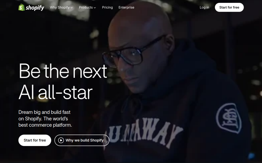
shopify.com
SaaS
“Be the nextAI all-star” sells an identity, not a clear reason to choose Shopify. For an entrepreneur deciding how to launch or grow a store, the first message should explain what they can build—not ask them to interpret an AI-themed ambition.
Capturing screenshot…
slack.com
SaaS
“All your people and AI agents working together.” sells a vision without explaining the work Slack helps teams get done. Headline clarity is only 5.7/10, and it carries the most weight: enterprise buyers need a concrete reason to evaluate Slack, not just agreement that collaboration is good.
Capturing screenshot…
framer.com
SaaS
Your headline sells a category before it sells an outcome. “The design agent for every step from idea to launch” never explicitly says “website,” so new visitors have to work out what they can build before deciding whether to start.
Capturing screenshot…
linear.app
SaaS
Your headline names a broad category—“product development system”—without making the everyday job obvious. New visitors should immediately understand that Linear helps product teams plan projects, manage issues, and ship with AI agents—not have to infer that from the interface demo.
Capturing screenshot…
figma.com
SaaS
“The full-stack creative canvas” describes your positioning, not what customers can do with Figma. Headline clarity scores just 3.1/10—the weakest of the heavily weighted conversion areas—and there is no explanatory hero subheadline to rescue it.
Capturing screenshot…
superhuman.com
SaaS
“One toolkit to win your workday” sells an aspiration before explaining the offer. Visitors looking for Superhuman Mail now have to distinguish Mail, Go, and Docs before they can confidently take the next step.
Capturing screenshot…
vercel.com
SaaS
“Agentic Infrastructure” names a category, not what a developer can accomplish with Vercel. Paired with the repeated “For coding agents” language, it makes your broad app-and-agent offer harder to understand than it needs to be.
Capturing screenshot…
airtable.com
SaaS
“Teams, workflows, agents — one space” names ingredients, not what customers can build or accomplish. You are asking visitors to interpret your positioning before giving them a concrete reason to start.
Capturing screenshot…
miro.com
SaaS
The hero describes collaboration but gives visitors no clear next step. The available actions—“Explore research” and “Explore the solution”—encourage browsing rather than starting a board or discussing an enterprise rollout.
Want a review like this for your site?
Get your free conversion and design score from Jev AI in seconds. No signup.